Women’s Aid is a national feminist organisation working since 1974 to prevent domestic violence and abuse in Ireland.
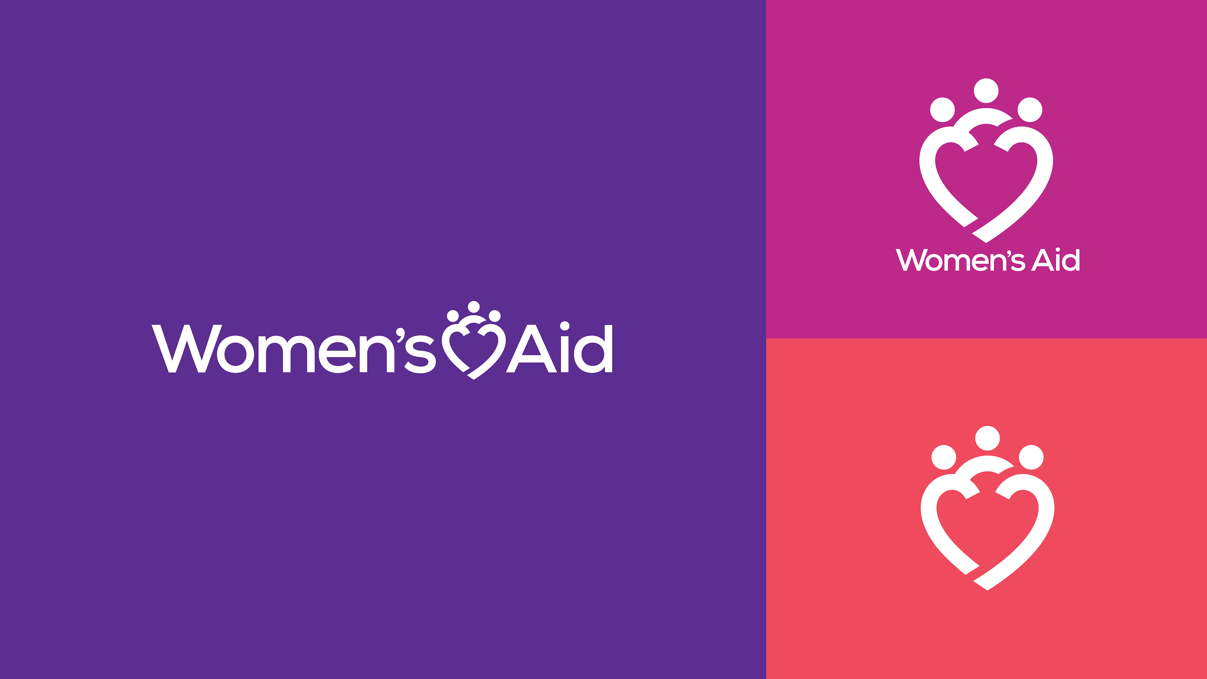
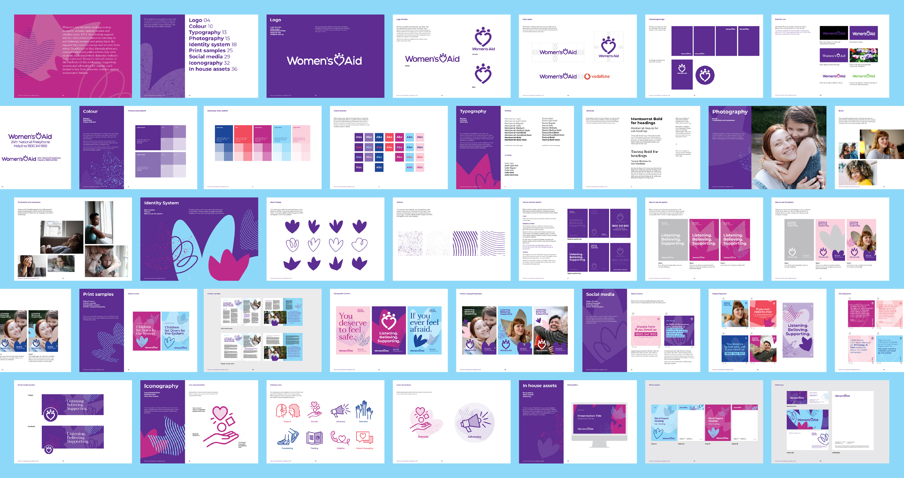
Their original 1990s woodblock logo carried powerful symbolism of protection and solidarity. Our task was to honour that legacy while creating a modern, more flexible identity.
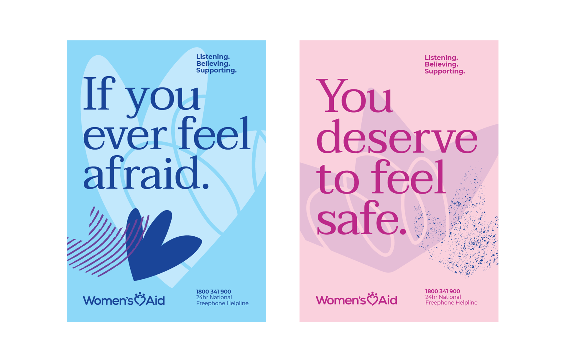
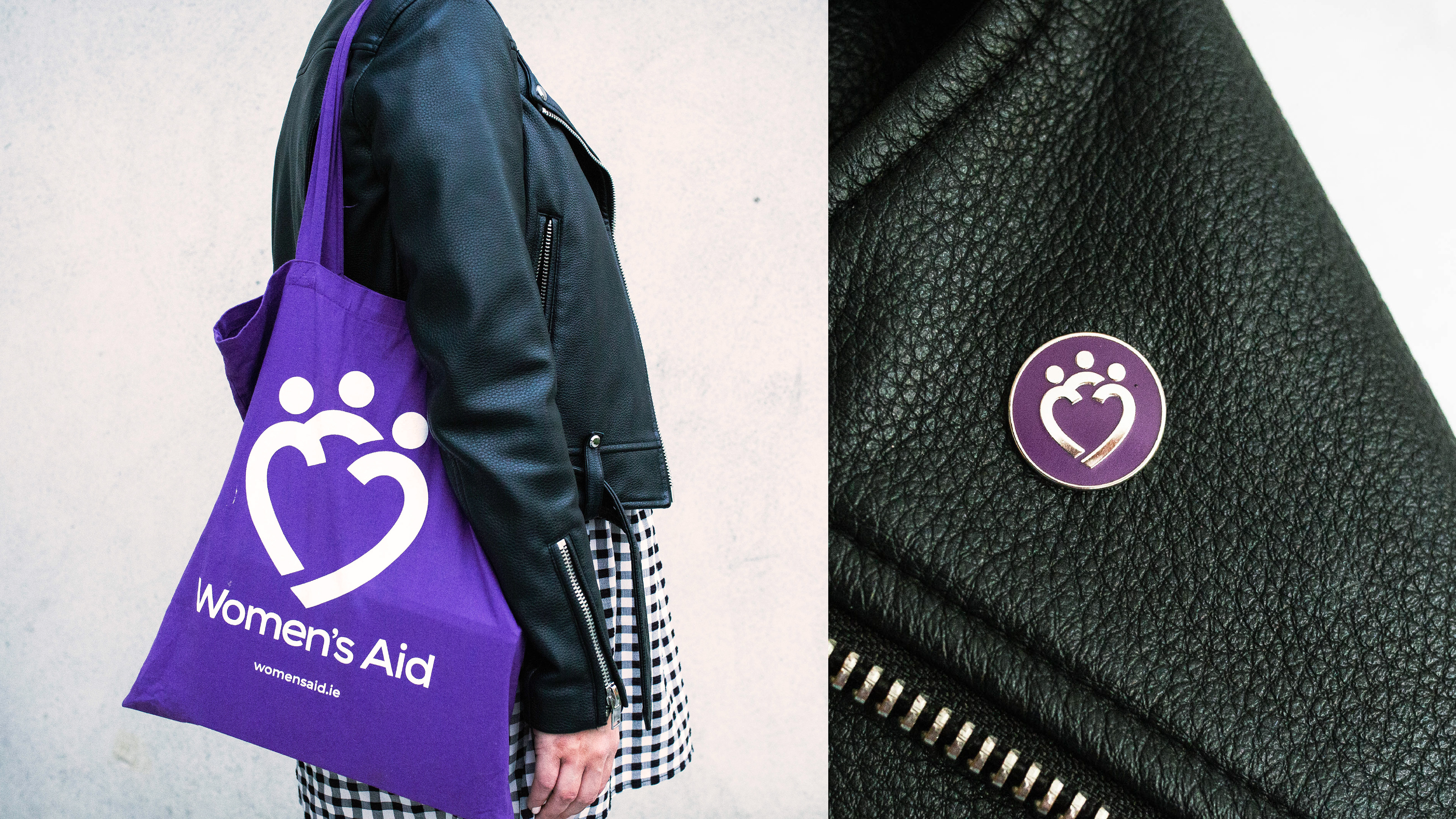
The new mark features three figures within a heart shape, representing support, strength and solidarity. The heart feels warm and caring, while the figures subtly reference the original artwork. The shape also suggests a shield, reinforcing protection and resilience.
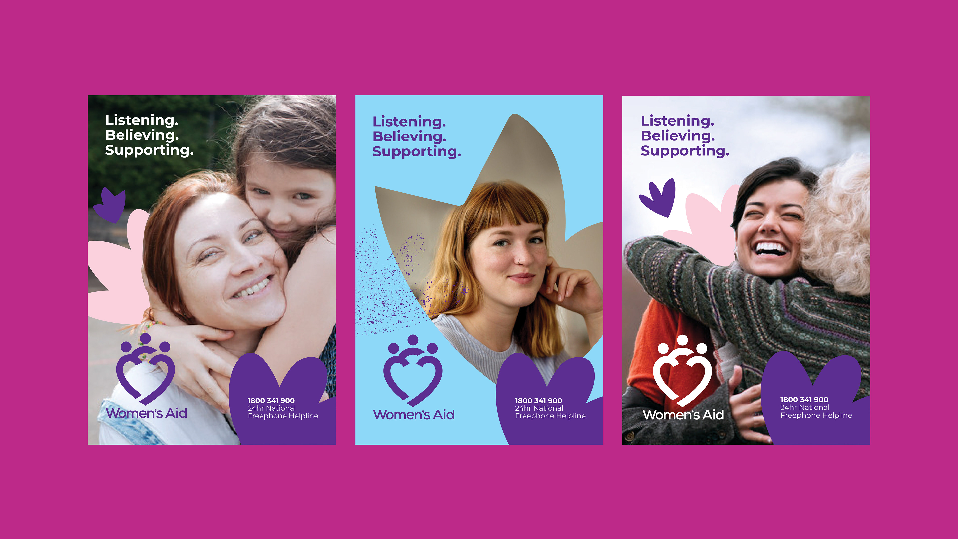
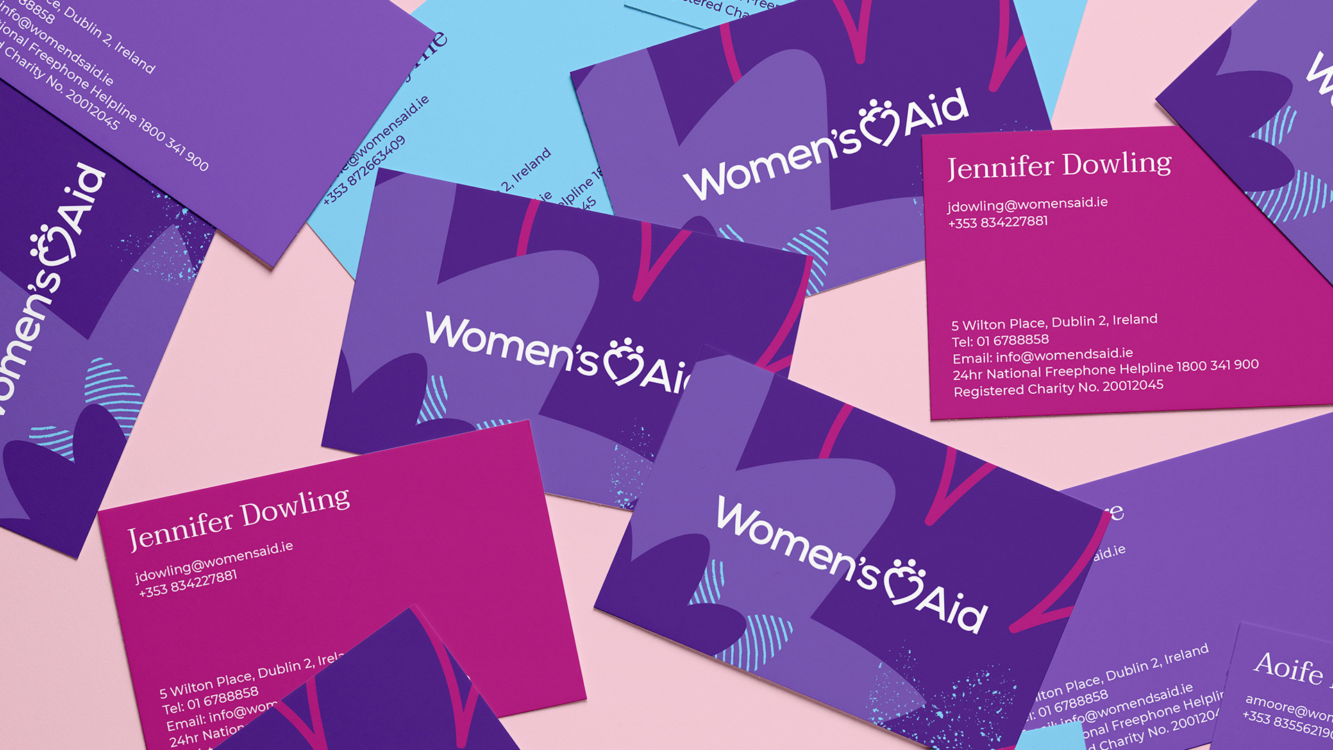
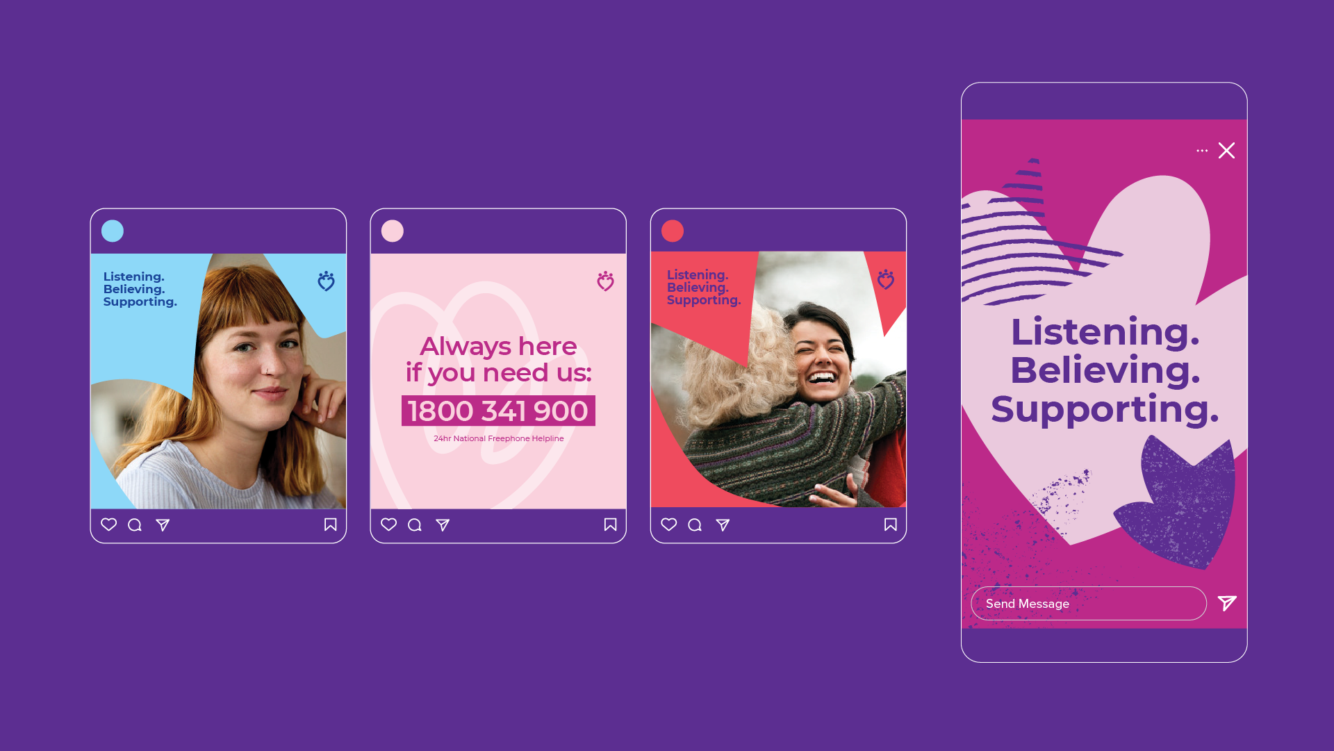
The wider identity system grows from this symbol. The patterns were derived from explorations of the heart shape, creating a cohesive visual language. The colour palette expands beyond the iconic purple to introduce brighter complementary tones, adding flexibility and optimism. Photography shifts the narrative from crisis to hope, highlighting women rebuilding their lives with strength and dignity.
The result is a confident, supportive and progressive identity, one that Women’s Aid can be proud to stand behind.
Created during my time at Language Communications.
Creative Director: Adam May
Account Manager: Katy Finnegan
Designers: Amy Heffernan, Lauren Shannon O'Brien
Account Manager: Katy Finnegan
Designers: Amy Heffernan, Lauren Shannon O'Brien