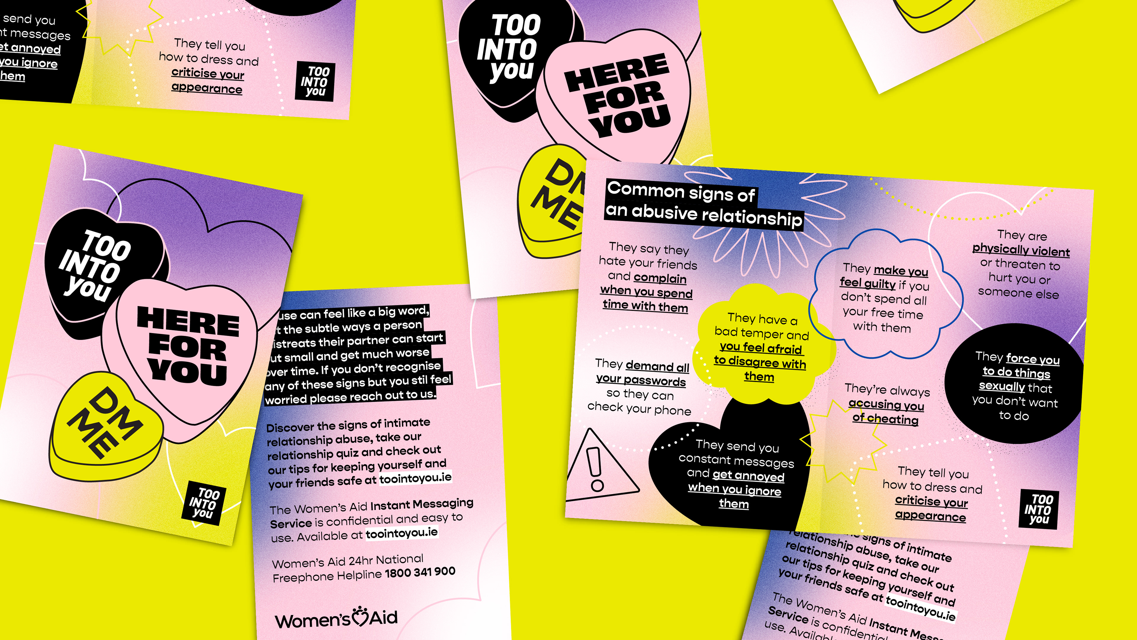
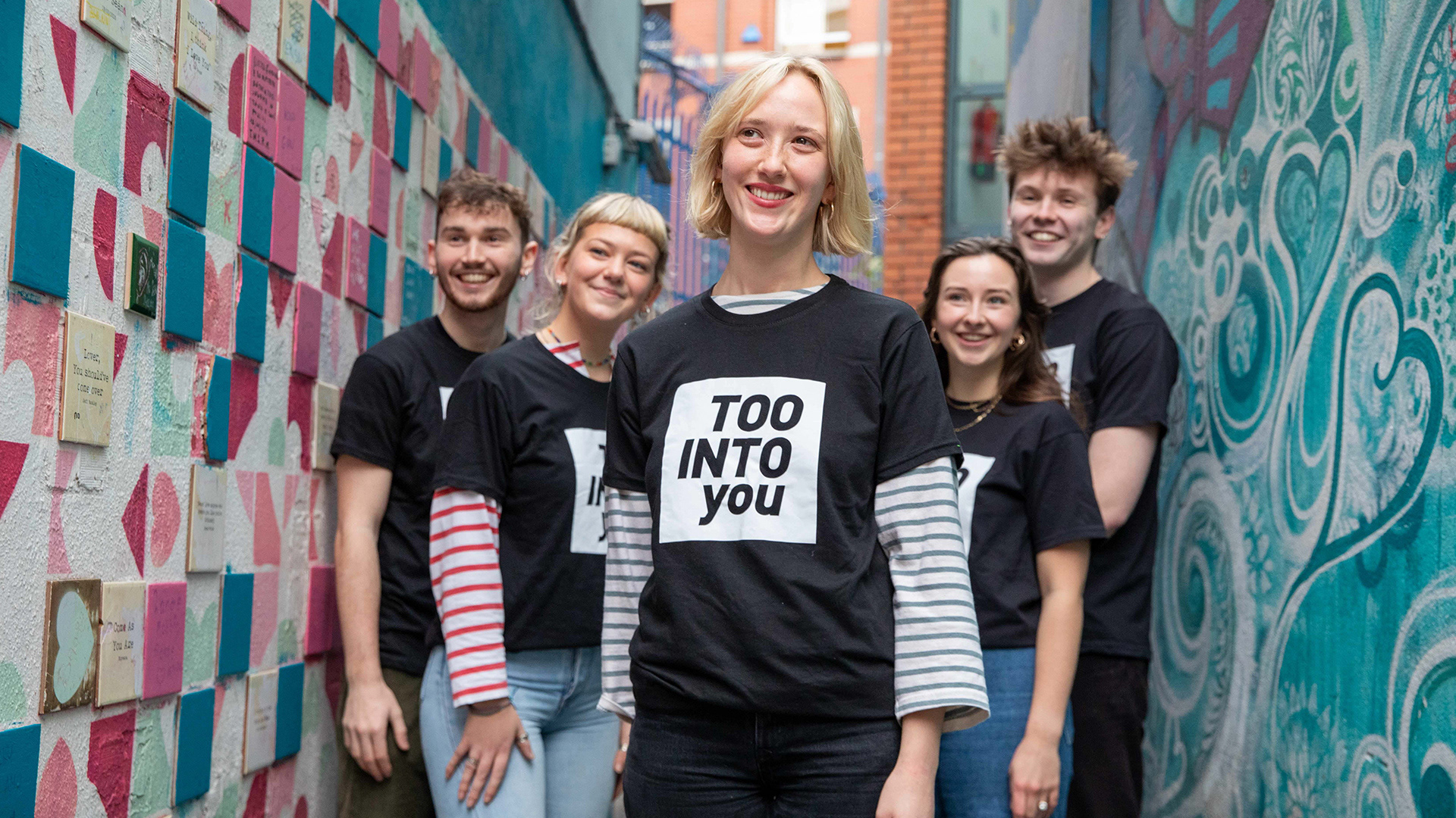
With a target audience of late teens to early twenties, TooIntoYou needs to stay visually fresh and relevant as it reaches new generations every year.
Having designed TooIntoYou’s original identity and various campaigns over the years, I was excited to refresh the brand and give it new life, building on an existing foundation while adapting for a broader, more inclusive audience. It was increasingly clear that relationship abuse is not just a feminist issue, and the organisation was exploring campaigns aimed at young men, encouraging them to call out misogyny and become allies in promoting healthy relationships.
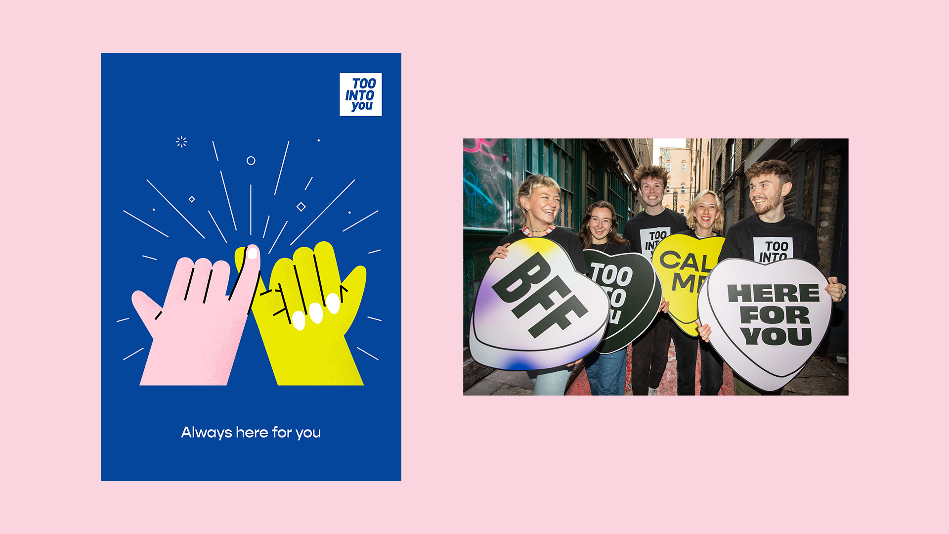
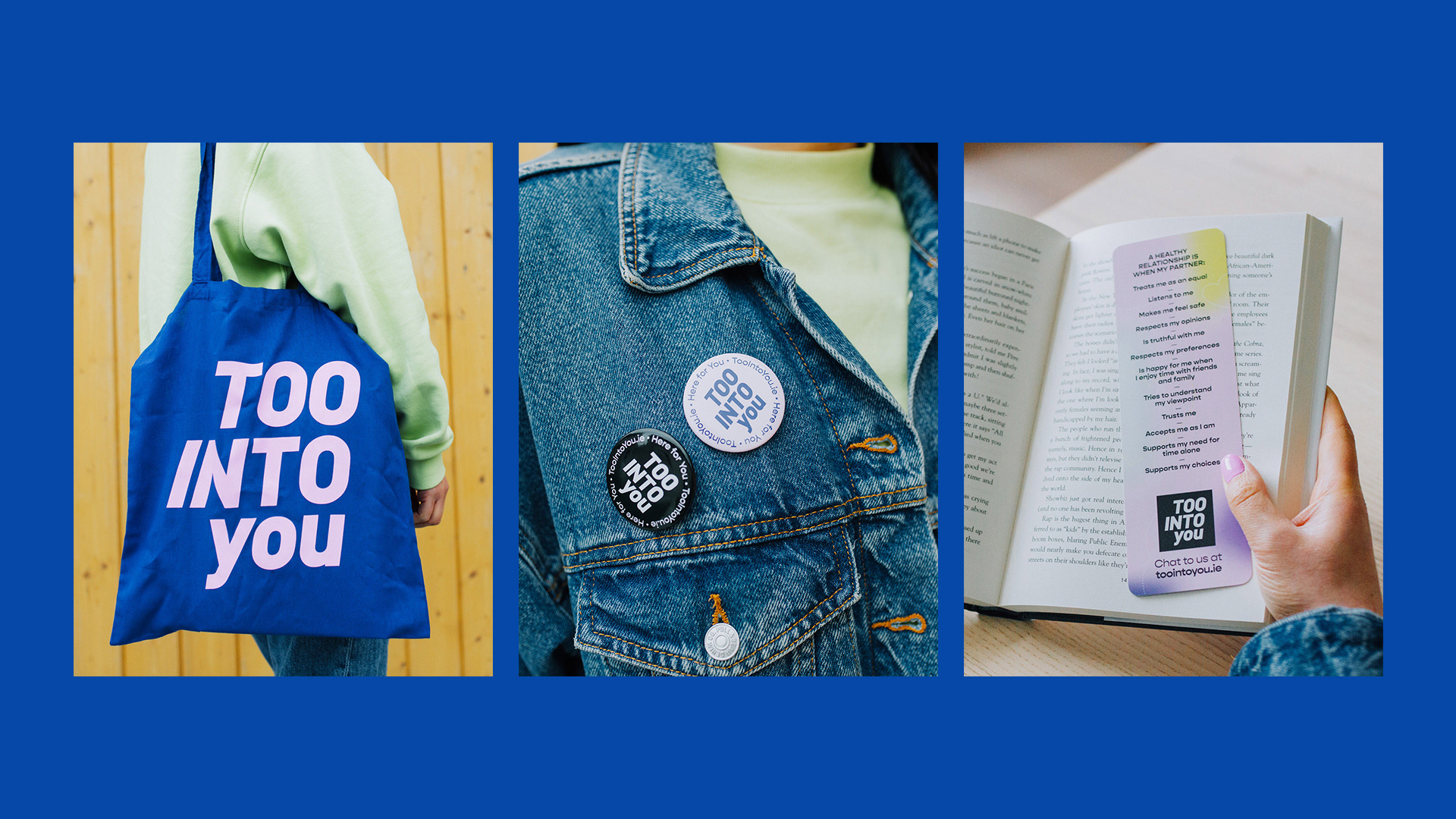
The refreshed identity moves away from hand drawn elements toward clean, vector-based illustrations. The colour palette was expanded to include blue and neon yellow, allowing for moving gradients and vibrant, eye-catching visuals.
The result is a streamlined, adaptable visual identity that helps non-designers within the organisation create content quickly and confidently, crucial for a demanding social media landscape.