The Data Protection Commission safeguards data protection rights in Ireland through guidance, supervision, and enforcement.
Workshops with the client revealed the need for a visual identity that was clean and professional, but deliberately avoided the typical corporate tech aesthetic.
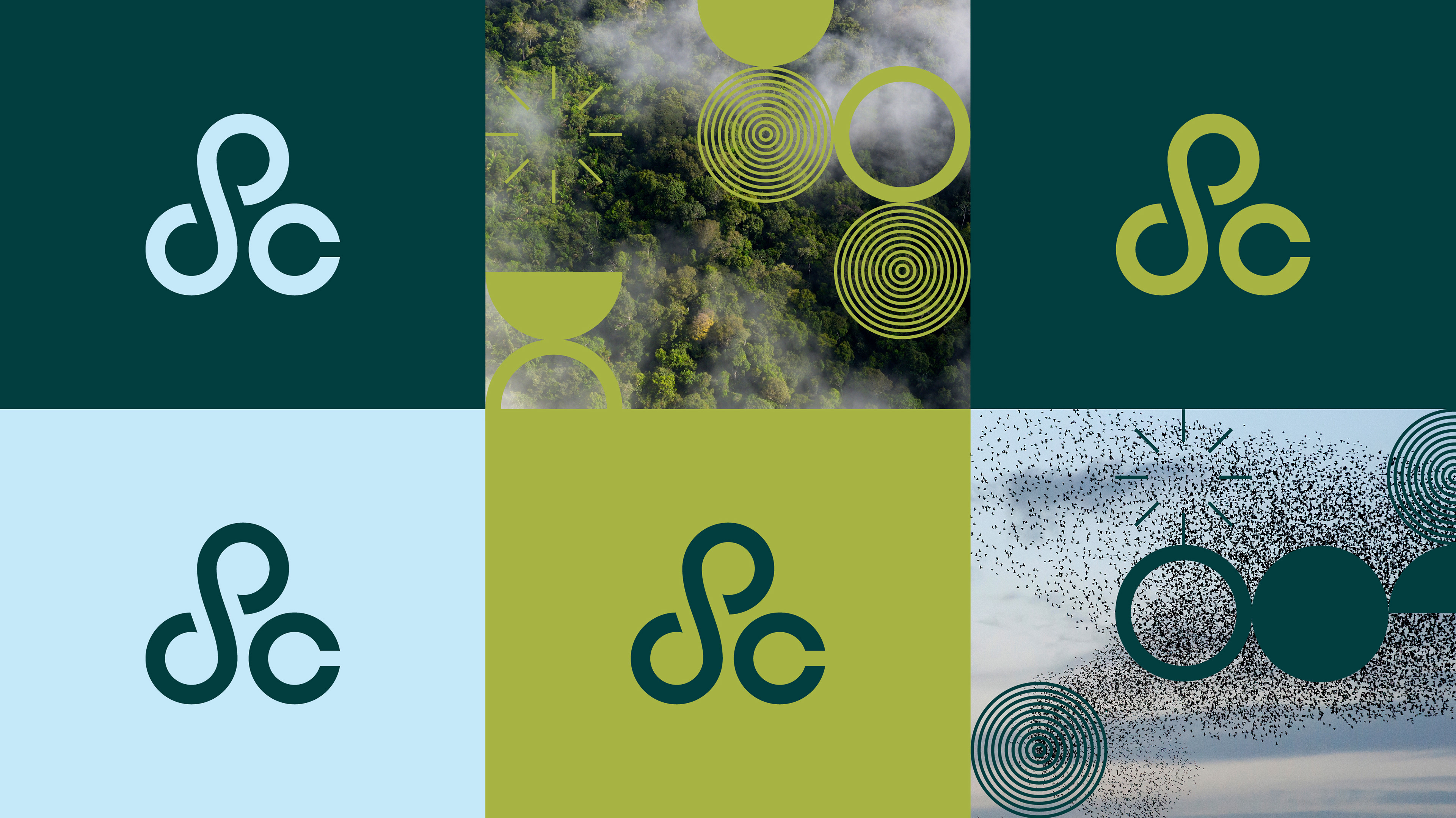
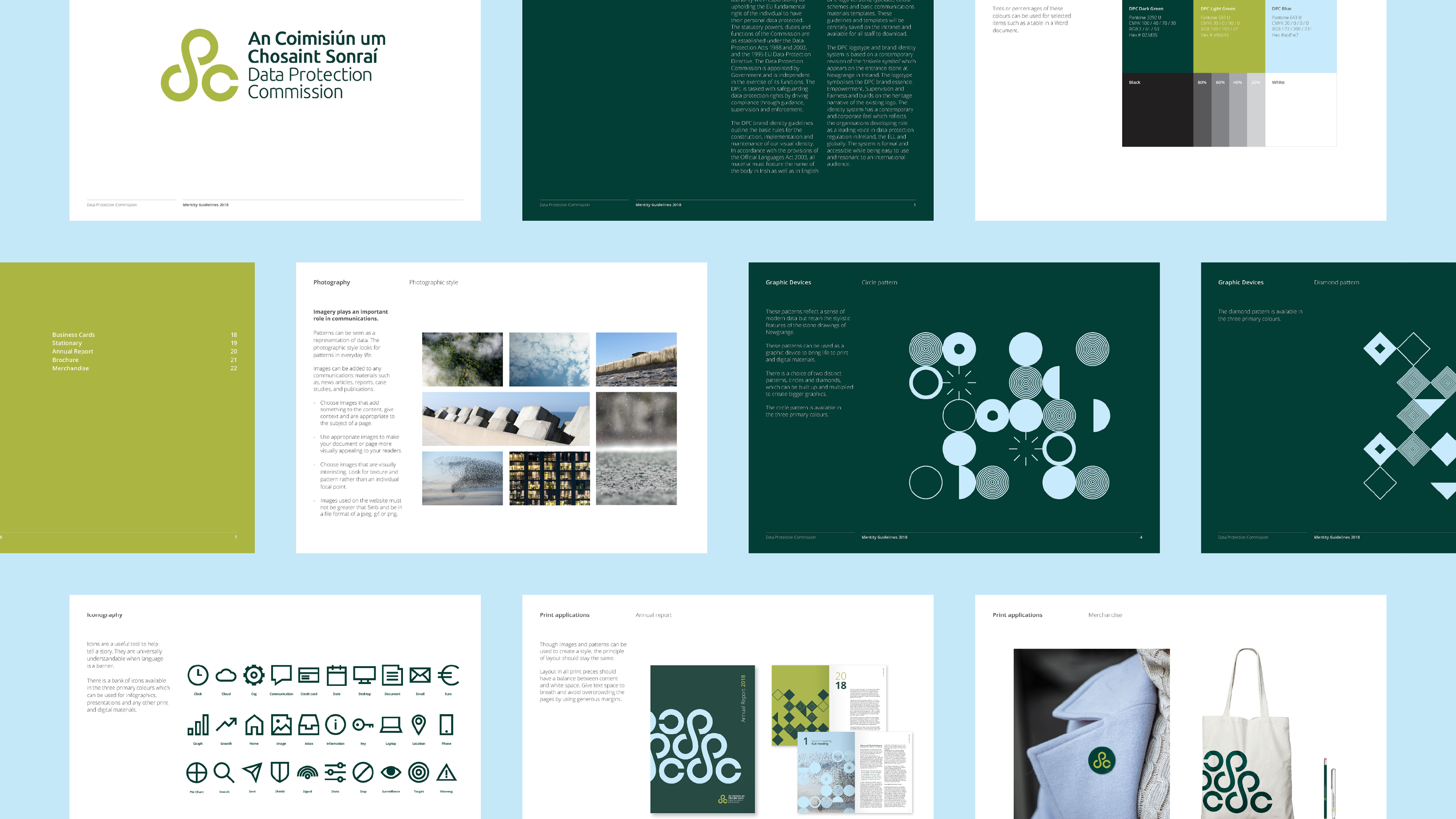
The mark takes inspiration from a Celtic symbol, the triskele. Its flowing, rotational form conveys movement — feeling like data in motion — while subtly referencing the letters D, P, and C. The result is a symbol that feels purposeful, and uniquely Irish too. The choice of photography continues the theme of movement in natural environments: drifting clouds, starling murmurations, raindrops, and stacked blocks all symbolic of data.

By avoiding tech clichés, the imagery feels human and conceptually aligned with the mark.
The wider identity system includes a professional yet flexible colour palette, custom patterns, and an icon library.
The outcome is fresh, unexpected, and distinct. A confident identity that sets the Data Protection Commission apart in an otherwise highly standardised industry.
Created during my time at Language Communications.